


 Tanja Magoc, Ph.D.
 Interpreting AI Predictions with Confidence
One of the most valuable functions of AI in medicine is its ability to predict whether a patient has a specific condition. However, not all predictions are created equal, and it’s essential to understand how to evaluate the performance of these classification models. By mastering a few key metrics, you can confidently interpret AI-driven insights and make informed decisions about patient care.
The resources on this page break down the core concepts of classification models, including the confusion matrix, sensitivity, specificity, positive predictive value (PPV), and the Area Under the ROC Curve (AUC). These metrics provide a framework for assessing how well a model distinguishes between positive and negative cases, enabling you to understand the reliability and potential impact of its predictions.
Resources
These resources explain how to measure the performance and reliability of AI classification models in healthcare. The videos and quick guide clearly explain key metrics like sensitivity, specificity, PPV, and AUC and how to apply them.
Understanding Key Classification Metrics
In the following video, learn how to interpret an AI model’s performance using key classification metrics. Starting with the basics, the confusion matrix helps to identify true positives, false positives, true negatives, and false negatives. From there, learn how to use metrics like sensitivity to see how well the model catches positive cases, and specificity to see how well it rules out negative ones. The video also covers Positive Predictive Value, or PPV, which can confirm how reliable a positive prediction actually is. Finally, the AUC score demonstrates the model’s ability to distinguish between cases, empowering clinicians to use AI predictions with confidence.
Transcript: Understanding Key Classification Metrics
One crucial function of medical AI models is predicting whether a patient has a specific condition. By understanding classification metrics, you can better assess AI model predictions.
Let’s consider a matrix that represents the intersection of AI predictions and the actual presence or absence of the condition. This matrix is called a confusion matrix. Picture a graph where one axis specifies the actual or true diagnoses. The other axis specifies the classification system’s prediction.
Each axis can then be divided into positive and negative zones. If the model predicts the presence of a condition and the condition is a true diagnosis, the box where those two zones intersect can be labeled a True Positive or TP for short.
Conversely, if the model predicts a patient is negative for a condition and the patient, in fact, does not have the condition, this zone can be labeled as True Negative.
The other two zones are then made up of combinations of a negative prediction, but an actual positive case, or a positive prediction, but an actual or true negative case.
Now that we’ve covered the confusion matrix, let’s conceptualize the key metrics of sensitivity, specificity and positive predictive value.
First, sensitivity or recall measures how well the model spots the target clinical diagnosis. Sensitivity tells us out of all actual cases, how many did we catch. It compares the number of true positives to the number of false negatives.
Next, specificity focuses on patients without the diagnosis. It tells us out of all negative cases, how many did we correctly rule out? It compares the number of true negatives to false positives. Specificity is the proportion of actual negatives correctly identified as negative by the model.
Positive Predictive Value, or PPV, is sometimes called precision. PPV tells us how reliable a positive result is. It’s the proportion of predicted cases that are actually correct. In other words, it compares the true positives to the false positives.
Finally, we need a way to determine the performance of our model. One way is to compare the true positive rate against the false positive rate. The AUC or Area Under the ROC curve measures exactly this. The AUC is the trade off between true positive rate and false positive rate at different classification thresholds.
While the calculation for AUC is complicated, your AI classification program should provide the AUC for you. Just remember that the closer to 1, the better.
These metrics, sensitivity, specificity, positive predictive value, and AUC empower you to interpret AI classification models confidently.
Classification Metrics Infographic
This infographic provides a visual guide to the core metrics used in AI model classification. It defines and explains the concepts of true/false positives and negatives, Sensitivity (recall), Specificity, Positive Predictive Value (precision), Flag Rate, and the Area Under the ROC Curve (AUC). The document uses these terms to help you assess how effectively a model performs and how much you can trust its predictions in a clinical setting.
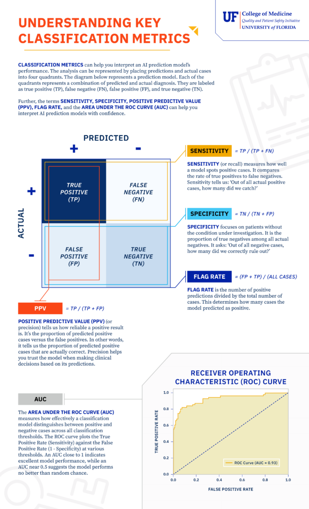
Download the Understanding Key Classification Metrics Infographic
Use this document for a comprehensive guide to understanding AI prediction model performance through a review of classification metrics:
- Define core classification metrics, including Sensitivity, Specificity, and Positive Predictive Value (PPV).
- Learn how the Area Under the ROC Curve (AUC) measures a model’s ability to distinguish between positive and negative cases.
- Understand the fundamental concepts of true/false positives and true/false negatives in model evaluation.
- Interpret the performance and reliability of AI prediction models in a clinical context.
Calculating Key Classification Metrics
In this video, learn how key classification metrics can help you interpret an AI model’s performance. Using a respiratory failure prediction model as an example, the video illustrates how sensitivity, specificity, flag rate, and positive predictive value (PPV) are calculated and how they inform clinical decision-making. The video also explains the Area Under the ROC Curve (AUC) and its significance in assessing a model’s overall accuracy. By understanding these metrics, you can confidently analyze a classification model’s results.
Transcript: Calculating Key Classification Metrics
How can classification metrics help you interpret an AI classification model’s performance? Five key metrics help you understand and better use AI models.
Let’s consider these classification metrics through an example. This example, respiratory failure prediction model analyzes historical EHR data to identify potential respiratory failure cases by recognizing critical symptoms, such as low oxygen levels, and rapid breathing as key markers.
As with all classification models, this one considers the actual diagnosis of a condition and the AI model’s predictions. We will use synthetic data related to respiratory failure for the various categories of prediction and actual diagnosis to illustrate the key classification metrics of sensitivity, specificity, flag rate, and positive predictive value.
First, sensitivity or recall measures how well the model spots the target clinical diagnosis. In our case, sensitivity tells how well the model identifies respiratory failure cases. Sensitivity tells us, out of all actual respiratory failure cases, how many did we catch?
In our model, with a sensitivity of 0.68, we’re identifying 68% of true respiratory failure patients. This is critical for early intervention to improve outcomes.
Next, specificity focuses on patients without respiratory failure. It is the model’s ability to designate an individual who does not have a condition as negative. Specificity tells us, out of all nonrespiratory failure cases, how many did we correctly rule out?
With a specificity of 0.97, our model avoids flagging 97% of healthy patients. This reduces unnecessary treatment.
A win for efficiency and patient comfort.
Flag rate is the number of positive predictions divided by the total number of cases. This determines how many cases the model predicted as positive. The total number of positives divided by the total number of patients is our flag rate.
In this case, the flag rate is 0.21, or 21%. A flag rate of 21% means the model flags 21% of all patients as potentially having respiratory failure, helping clinicians prioritize follow-up while minimizing unnecessary interventions.
Positive Predictive Value, or PPV, tells us how reliable a positive result is. It’s the proportion of predicted respiratory failure cases that are actually correct.
With a precision of 0.88, 88% of our respiratory failure predictions are spot on. This increases trust in the model when acting on its predictions.
Finally, we need a way to determine the performance of our model. One way is to compare the true positive rate against the false positive rate. The AUC, or Area Under the ROC Curve, measures exactly this.
An AUC of 0.93 means our model is excellent at distinguishing respiratory failure from nonrespiratory failure.
For AUC calculations, remember that the closer to one, the better.
In summary, while the program or software that runs your classification model will most likely provide these numbers to you, understanding how they are calculated will help you confidently analyze a classification model’s results.