 Frederick Southwick, MD
 What is Value Stream Mapping?
Have you ever felt that your team is working incredibly hard, but the system itself creates delays and frustration? Value stream mapping is a powerful tool for diagnosing this exact problem. It visualizes the entire flow of a process—like a patient’s journey through the emergency department—making the invisible work visible. By creating a shared map, your team can move from guessing about problems to seeing exactly where breakdowns and opportunities for improvement exist.
The map is built using simple components: process boxes show each step, while data boxes capture the time it takes. This allows you to perform the map’s most critical function: distinguishing between value-added time (actions that directly benefit the patient) and non-value-added time (waste). When you add work-in-progress symbols, bottlenecks become immediately obvious. While a value stream map doesn’t provide all the answers, it gives your team a data-driven guide that shows you exactly where to look to make patient care safer and more efficient.
Value stream maps and process maps complement each other. The value stream map is usually a higher-level or more distant view of multiple processes. When the value stream map reveals a bottleneck, process mapping is used to correct the deficient process.
Resources
The resources below provide a practical guide to understanding and applying value stream mapping in a clinical setting.
Creating a Value Stream Map
Watch this video to learn the fundamentals of value stream mapping. It explains how to visualize a clinical process, identify key components like process boxes and data boxes, and distinguish between value-added time and waste to uncover bottlenecks.
Transcript: Understanding a Value Stream Map
Have you ever felt like you’re working incredibly hard, but the system itself is slowing you down? You know there’s a better way, but it’s hard to fix a problem you can’t see.
A powerful tool for making your work visible is the value stream map. Think of it as creating a map of your process, just like a map of a river. It shows you where the flow is smooth and where it gets stuck behind rocks and barriers. It helps the entire team see the same process, the same problems, and work together on the same solutions.
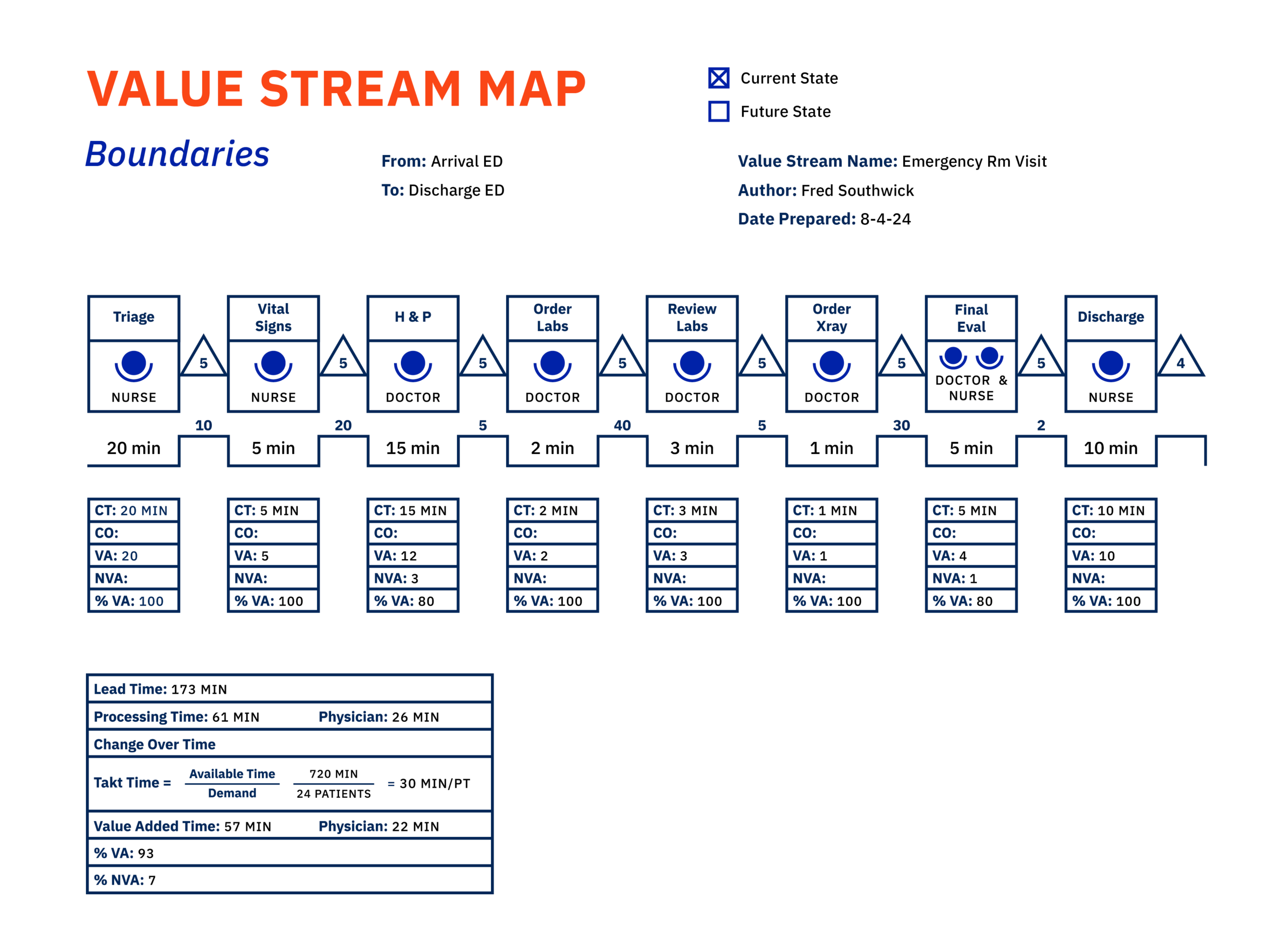
Every map starts with process boxes. These show each individual step where a staff member interacts with the patient or product. For a patient in emergency care, it might be triage, vital signs, and history and physical or HMP.
Underneath each step is a data box. This is where we capture time. The most important number here is cycle time or CT. Cycle time is how long it takes to complete that one step. Traditionally, the data box also includes any change over time or CL. These are activities that are performed to prepare for a process, for example, prepping an LOR. In this example, we do not have any change over time.
Next, we ask the most critical question, how much of that time was value added? Value is anything that improves the patient’s health and that they would be willing to pay for. Was the process done correctly the first time?
Did it directly benefit the patient? Any time spent in the process that does not benefit the patient is non-value or waste. Recording this in the NVA box helps us see how much of our effort is truly helping.
For example, in the history and physical step, there are three minutes of waste. In this example, perhaps the physician asked a few unnecessary questions and they may have been a little slow in completing the physical exam.
By comparing our cycle time and waste time, we can compute the percent of time that was value added. Now we need to connect our process boxes. The line between them shows the time spent in motion– walking, waiting, or transport.
But what about the backlogs? A triangle represents Work In Progress or WIP. It’s a snapshot of how many patients are stuck waiting between steps. A large number here instantly shows you a bottleneck, a place where the system is clogged.
When you map an entire process from patient arrival to discharge, you get a complete picture. You can create a shared mental model. Suddenly, conversations change. Instead of guessing, the team can point to the map and say, look, we have a major bottleneck here.
If we fix this one step, we can improve the experience for every patient and save ourselves hours of frustration.
An example bottleneck in an ER setting might be the delay between when the patient is seen by the nurse and then by the physician. By identifying the bottleneck, the team can begin thinking of solutions.
The team may change their process when a patient is delivered to the ER via ENT. In that case, everyone swarms when the ENT delivers the patient to the room. Everyone could then hear the handoff at the same time.
During the huddle, the team could agree on the preliminary plan of action. This is a major way to save time.
Like a river map, the value stream map helps you spot where your clinical process is flowing well and where there are obstacles. A value stream map can help your team uncover waste, such as delays or unnecessary steps, and measure process times to distinguish value added from non-value added activities.
A value stream map doesn’t give you the answers, but it tells your team exactly where to look.
Value Stream Mapping in Emergency Care: An Example
The infographic below provides a detailed walkthrough of a value stream map created for an emergency care setting. Use it to understand how a map is constructed and analyzed. It includes:
- A summary of the final performance metrics, including total lead time and the percentage of value-added time.
- A complete value stream map diagram for a patient’s journey through the ED.
- A step-by-step breakdown of the process, including cycle times and identified waste.