
 Tanja Magoc, Ph.D.
  Wenbin Guo, PhD
 Understanding Process Variation
Control charts are powerful tools for monitoring how a process changes over time. By plotting data in sequence, these charts help you distinguish between the natural variation inherent in a stable process and variation that indicates a specific, identifiable problem has occurred. A control chart displays a centerline for the process average, along with upper and lower control limits that define the expected range of variation.
In a clinical environment, this allows you to effectively monitor key metrics, but the power of a control chart depends on choosing the correct type. The selection process depends on whether your data is continuous or discrete, your sample size, and whether you need to detect large, abrupt shifts or small, incremental ones. The resources below provide a clear path to selecting and using the right chart for your needs.
Resources
The resources below will guide you through selecting the correct control chart for your data and provide practical instructions for creating and interpreting them.
Statistical Process Control Charts Infographic
Download a copy of this easy-to-follow infographic for immediate reference during control chart selection.
Download the Statistical Process Control Charts Infographic
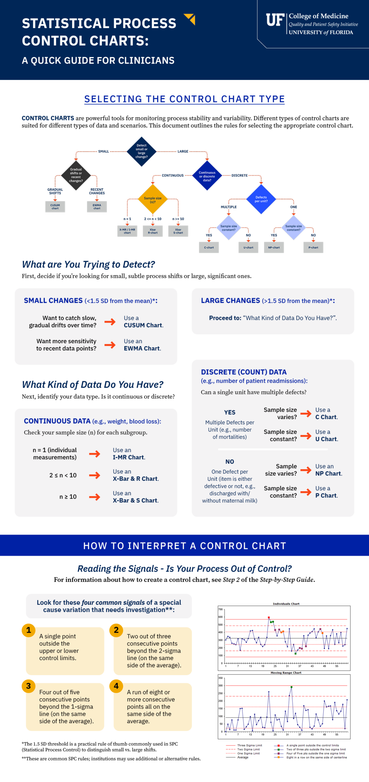
- This guide helps you distill the decision process into two key steps: determining if you need to detect small or large changes, then identifying whether your data is continuous or discrete.
- It also includes a summary of the four most common signals used to identify when a process is out of control.
Choosing the Right Control Chart for Your Data
This short video walks you through a simple, question-based process to selecting the correct control chart. It begins by asking whether you need to detect large, obvious process changes or small, subtle shifts. Based on your answer, it guides you through additional questions about your data type (continuous vs. discrete), sample size, and whether a unit can have multiple defects, leading you to the most appropriate chart for your project.
Transcript: Choosing the Right Control Chart for Your Data
In healthcare, monitoring our process is key to improving quality. Statistical Process Control Charts, or SPC charts, are powerful tools that help us see if a process is stable or if changes are occurring.
But with so many different charts, how do you choose the right one? This video will walk you through a simple, question-based process to select the correct control chart for your data.
The first question to ask yourself is: are you trying to detect small, subtle shifts in your process, or are you looking for large, more obvious changes?
A small change is a deviation of less than 1.5 standard deviations from the average, while a large change is 1.5 standard deviations or more.
If your goal is to detect small changes, you have two primary options. If you want to spot gradual shifts over a long period, your best choice is the CUSUM chart. It tracks the cumulative sum of deviations from your target, making slow drifts easy to see.
But if you’re more interested in recent performance and want to give more weight to the newest data, you should use the EWMA chart.
If you’re looking for large changes, your next question is about your data type. Is it continuous or discrete?
Continuous data can be any value in a range, like a patient’s weight or the volume of milk a baby consumes. Let’s say your data is continuous. The right chart depends on your sample size or “n.”
If you are taking individual measurements, where “n” equals one, use an I-MR chart.
If your subgroup size is between two and nine, use an X-bar and R chart.
And for larger subgroups of 10 or more, choose the X-bar and S chart.
Discrete data is based on counts, for example, the number of patients readmitted within 30 days.
Now, if your data is discrete, you have a different set of questions.
First, can a single unit have more than one defect? Let’s follow the multiple defects path. An example is monitoring the number of mortalities, where a unit can have multiple distinct issues.
The next question is whether your sample size is constant or if it varies.
If the sample size is constant, use a C chart. If the sample size varies, use a U chart.
What if your unit can only be defective or not? For example, a baby is either discharged with maternal milk or without. It’s a yes-or-no outcome.
Here, we ask the same final question: is your sample size constant?
If the sample size is constant, use an NP chart. If it varies, your final choice is the P chart.
By following these steps, you can confidently choose the most effective control chart for your project. Answering these simple questions will ensure you’re using the right tool to monitor your process and drive meaningful improvement.
Statistical Process Control Charts Step-by-Step Guide
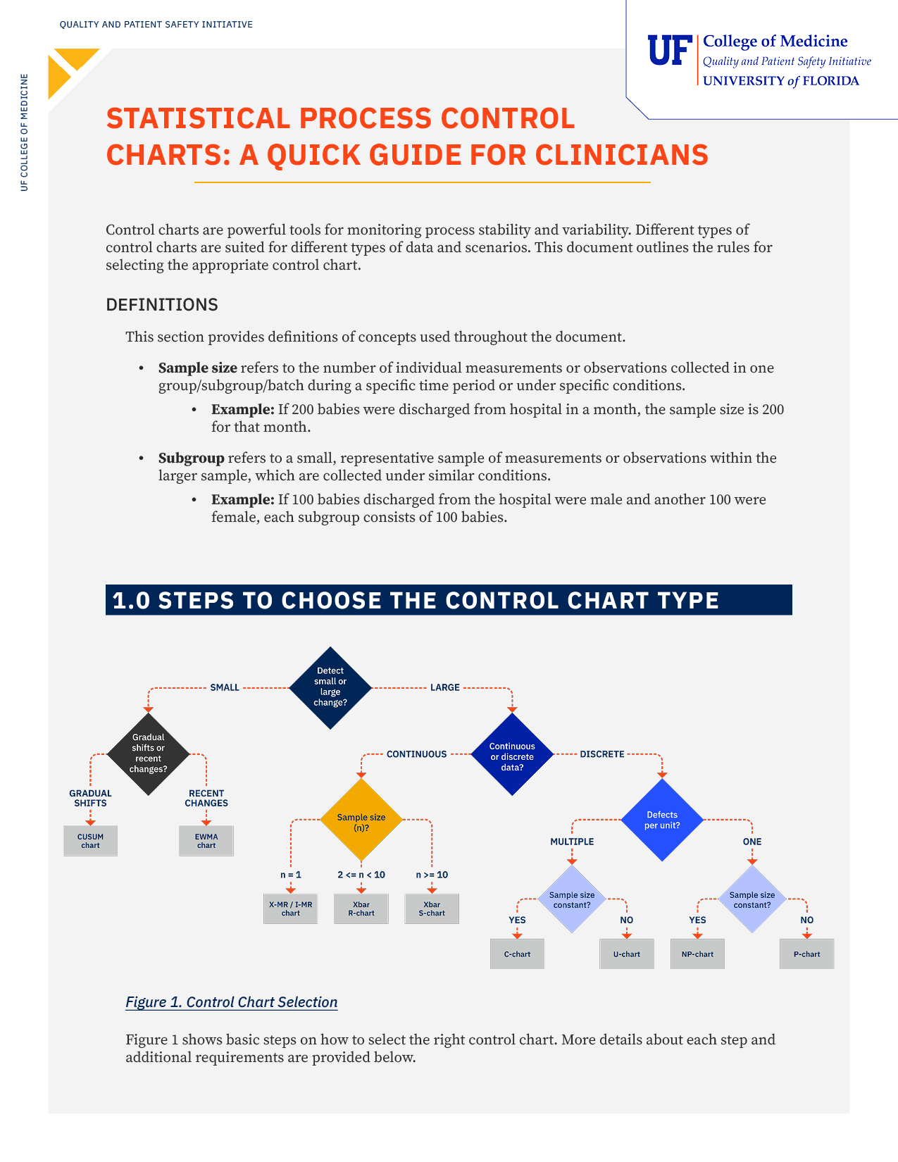
Our comprehensive downloadable guide for clinicians provides a step-by-step framework for selecting the appropriate control chart based on your data type and improvement goals. It covers charts for both continuous and discrete data, details the assumptions for each, and offers clear examples relevant to a clinical setting. The guide also includes detailed instructions for creating a common chart type, the I-MR chart, which is used when your sample size for each measurement is one.
Download the Step-by-Step Guide to Choosing the Right Control Chart
Key Takeaways:
- The first step in choosing a control chart is to decide whether you need to detect small, subtle process changes or large, significant ones.
- You must determine if your data is continuous (measurements) or discrete (counts) to narrow down the appropriate chart options.
- For continuous data, the subgroup size determines the chart (e.g., I-MR, X-Bar & R). For discrete data, whether the sample size is constant or variable is the deciding factor (e.g., C vs. U chart).
- Reading a control chart is not subjective; it involves looking for specific statistical signals to identify if a process is out of control.
Control Chart Template
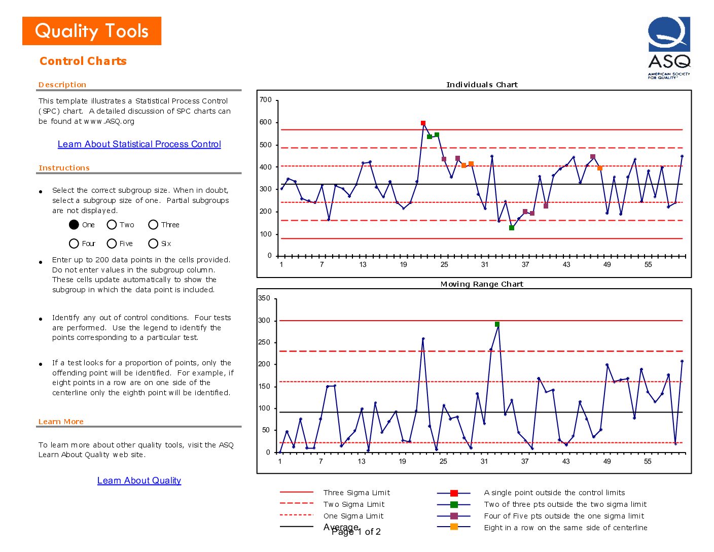
This downloadable Excel file, available through the American Society for Quality, provides a ready-to-use template for creating an Individuals and Moving Range (I-MR) chart. The template includes step-by-step instructions for entering your data and automatically generates the chart. It also helps you interpret your process by explaining the four statistical rules for identifying out-of-control signals, such as a single point falling outside the control limits or a run of eight consecutive points on one side of the average.
Download the ASQ Control Chart Template
Use this template to:
- Monitor a process and fix problems as they happen.
- Predict the expected range of results from a process.
- Confirm if a process is stable and performing consistently.
- Determine if variations are caused by unique events or are just a normal part of the process.
- Decide whether to focus on preventing specific problems or making bigger changes to the process itself.