
 Omjoy Ganesh, PhD, PharmD
 What is a Run Chart?
In quality improvement, it’s essential to know if the changes you’re making are actually leading to improvement. A run chart is a simple yet powerful tool that helps you do just that. It is a line graph that plots data points over time, providing a dynamic view of performance rather than a static snapshot. This allows your team to visualize trends, shifts, and patterns in a process or outcome.
The true strength of a run chart is its ability to help you distinguish between normal, random variation and significant, non-random change caused by your interventions. By plotting a measure—like weekly patient falls—the chart provides a clear visual feedback loop. The addition of a median line acts as a stable reference point, making it easier to spot trends that signal a real improvement or a problem that needs attention, empowering your team to make data-driven decisions.
Resources
The resources below offer step-by-step guides, quick-reference visuals, and tools to help you create and effectively use run charts for your quality improvement projects. Start with the videos and infographic to understand the concepts and best practices, then use the downloadable files to build your own.
Understanding Run Charts
This video introduces the run chart as a foundational quality improvement tool. Learn how it displays data over time to distinguish between random variation and meaningful change, helping you track the impact of your interventions.
Transcript: Understanding Run Charts
Run chart is a simple line graph that displays data points over time. It helps you visualize trends, shifts, or patterns, and process or outcome.
Run charts are important because they allow teams to see performance over time and detect whether things are changing or leading to an improvement. It’s not a snapshot or an average. Rather, a run chart shows real-time progress helping teams distinguish between random variation and meaningful change.
It’s a foundational tool in continuous quality improvement because it supports data-driven decision-making.
Let’s say a hospital wants to reduce the number of patient falls. They implement a rounding protocol and come up with a project idea. They track fall rates weekly and plot those. A run chart then would show the fall rate before and after the intervention.
If the chart shows a downward trend, it suggests that that protocol is working. If not, the team knows that they have to reassess and have to come up with a new idea or figure out what’s going on.
The visual feedback loop is very powerful for guiding you to the next step.
Constructing a Run Chart
Learn the straightforward steps to building your first run chart. This guide covers setting up your axes, plotting data, and adding a median line to help you identify significant shifts and trends in your process.
Transcript: Constructing a Run Chart
Creating a run chart is straightforward. You just need an x-axis and a y-axis.
On the x-axis, you plot your time intervals– could be days, weeks, months, minutes, years, whatever works best for you and your project.
On the y-axis, you plot a measure of interest– could be the number of falls, wait times in an ED, or infection rates.
Once you have your x and y-axis, you add data points. Go ahead and plot them on the x and y-axis and then connect them with a line, a straight line, not a curved line.
Once you have that, you need something to help you interpret your data. And the best option here is a median line.
The median is crucial because it helps identify non-random patterns in your data. Unlike the mean, the median is less affected by outliers and it gives you a stable reference point.
The median itself shows you where 50% of your data falls above or below a line.
When data points consistently fall above or below the median, it could indicate a shift or a trend which can signal improvement or problem that needs attention.
You can go ahead and do this in Excel, Google Sheets, or you could hand-draw it. What matters is that you’re consistent and clear.
Getting Started with Run Charts: A Few Tips
Discover practical tips for making your run charts a success. This video explains how to engage your team, use real-time data, and tell a compelling story with your chart to maintain momentum on your project.
Transcript: Getting Started with Run Charts:
So a few practical tips. Start simple. Pick one measure. Track it consistently. Use real-time data. Don’t wait for perfect data.
Start with what you have. Doesn’t matter if people say it’s dirty. Go ahead and plot it anyway.
Engage your team. Involve frontline staff choosing measures and interpreting the results so they can understand things together.
Celebrate insights. Use the chart to highlight wins and learn from setbacks.
Be able to tell the story with your data.
And finally, keep it visible. Post charts and team huddles or dashboards or any way to get that out there, because you need to keep that momentum.
Run Charts: Tips for Creating an Impactful Chart (Infographic)
This quick-reference infographic outlines essential best practices for building, interpreting, and utilizing run charts effectively. Whether you build your chart in Excel, Google Sheets, or draw it by hand, you can use this visual guide to help your team maintain momentum and make data-driven decisions.

Download the Tips Sheet
- Start simple: Track one measure consistently using real-time data rather than waiting for “perfect” numbers.
- Add a median line: Use this stable reference point to quickly spot non-random changes and sustained runs.
- Keep your chart visible: Post charts in team huddles or on dashboards to evaluate interventions, engage front-line staff, and celebrate insights together.
DIY Run Chart Tool
Use this tool to create your own run charts for the quality measures your site is tracking.
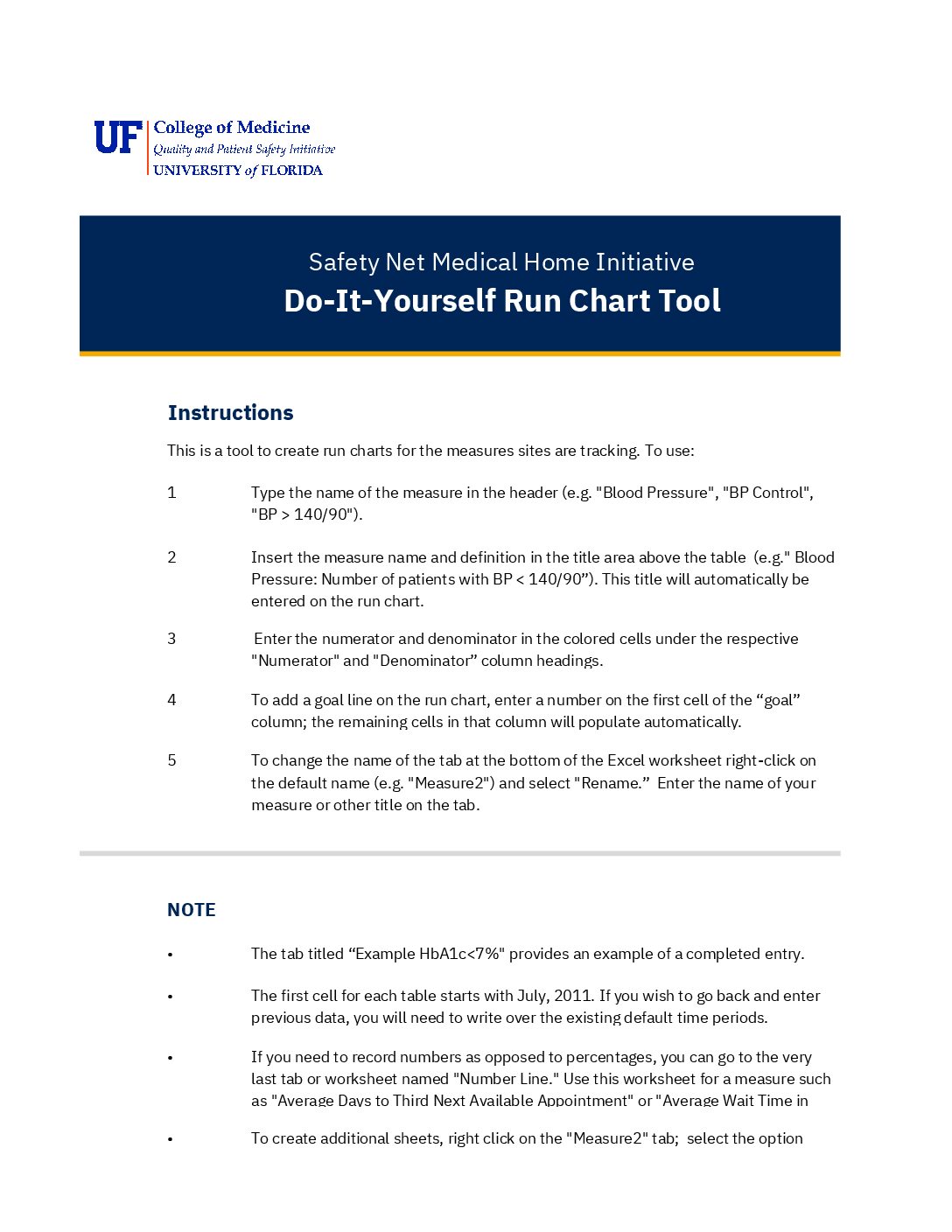
Download the DIY Run Chart Tool
This downloadable Excel tool provides a simple, structured way to build your own run charts. It includes:
- Tips for copying your charts into presentations to share with your team and leadership.
- Instructions for entering your measure name, definition, numerator, and denominator to automatically generate a graph.
- An example tab showing a completed chart for reference.
- A separate worksheet for tracking raw numbers (like average wait times) instead of percentages.