

What is Power BI?
In a data-rich clinical environment, having the ability to quickly visualize and analyze information is essential. Power BI is a powerful business intelligence tool that does just that. It transforms complex datasets into clear, interactive reports and dashboards. For clinicians and quality improvement teams, this means you can track outcomes, monitor performance metrics, and explore patient data in a highly visual and intuitive way, all without needing to be a data expert.
The true strength of Power BI lies in its interactivity. Dashboards are not static reports; they are dynamic workspaces. You can click on a segment of a graph or a row in a table and watch as all the other visuals on the page instantly filter to reflect your selection. This allows you to drill down into the data, ask questions, and uncover insights on the fly. While it is a powerful tool for informing decisions, it is important to remember that it is no substitute for trained clinical judgment.
Resources
The resources below provide a practical guide to the essential functions of Power BI. Use the video for a dynamic walkthrough or the handout as a quick reference guide to get started.
Getting Started with Power BI Dashboards
Watch this video for a step-by-step walkthrough of how to navigate, filter, and interact with Power BI dashboards. This guide, featuring a QPSi dashboard as an example, covers the essential skills you need, from logging in and applying filters to understanding visualizations and exporting data.
Transcript: Getting Started with Power BI Dashboards
Power BI is a business intelligence tool that transforms data into interactive visualizations and reports. This enables clinicians to analyze patient data, track outcomes, and make data-driven decisions efficiently.
In this video, you’ll learn the basic skills you need to interact with any Power BI dashboard.
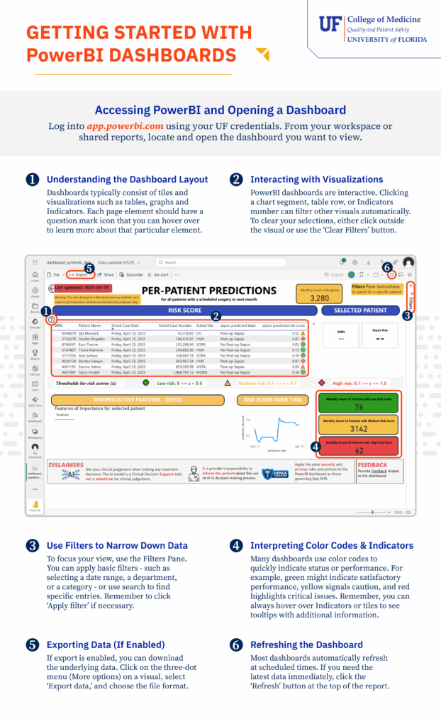
First, let’s access the dashboard. You can log in to app.powerbi.com using your UF microcredentials. From your workspace or shared reports, locate and open the dashboard you want to view.
In this example dashboard, the data is purely synthetic, meaning they were computer generated for this demonstration. Dashboards typically consist of tiles and visualizations such as tables, graphs, and indicators.
Let’s focus on the filters. Power BI contains a lot of data. To focus your view, use the Filters pane. You can apply basic filters or use the search to find specific entries.
Remember to click Apply Filter if necessary. Remember that Power BI dashboards are interactive. Clicking a chart segment, table row, or indicator number can filter other visuals automatically.
To clear your selections, either click outside the visual or use the Clear Filters button. Many dashboards use color codes to quickly indicate status or performance. For example, green might indicate satisfactory performance, yellow signals caution, and red highlights critical issues.
Keep in mind that you can click on the question mark icon on indicators or tiles to see tooltips with additional information.
If export is enabled, you can download the underlying data. Click on the export dialog at the top of the screen and choose the file format.
The data in Power BI is updated constantly, thus most dashboards automatically refresh at scheduled times. If you need the latest data immediately, click the Refresh button at the top of the report.
Keep in mind that even though Power BI is a powerful data dashboard, it is no substitute for trained clinical judgment. Be sure you review the disclaimers provided at the bottom of the dashboard.
Now you know how to navigate, filter, and interact with Power BI dashboards.
Learn the Power BI Dashboard Layout
Use this handout as a quick reference guide to the fundamental functions of Power BI. It provides clear, section-by-section instructions for:
- Accessing dashboards
- Using the filters pane
- interacting with visuals
- Interpreting common features